We all have things we hold onto for far too long. Clean-up projects hit the trifecta of misery.
Redesigning a website is a series of time-consuming chores that are psychologically, emotionally, and financially overwhelming. And it doesn’t help that most of us hardly know where to start-it’s much easier to convince yourself that technically, the site still functions, right? With our dedicated education team, we had the difficult conversation about our North Dakota Studies website and made the call to redesign it.
Website redesign is not a small task, but let’s face it. You probably need it. Why?
1. To create a better user experience.
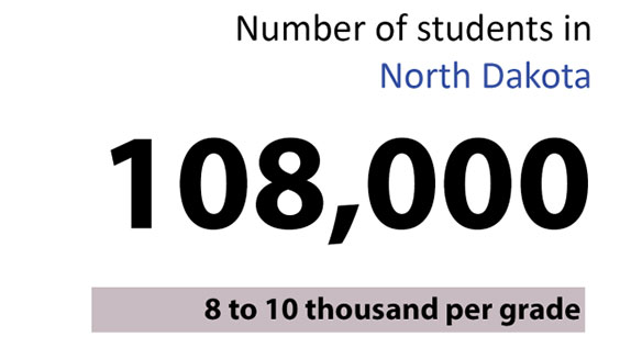
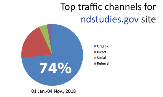
User or customer experience (UX or CX) are industry jargon for what gets down to the question of who is your customer? When we began the revamp of the ndstudies.gov website, we took a hard look at our numbers. How many students does ND serve? How are our users finding us?
2. Your website isn’t working.
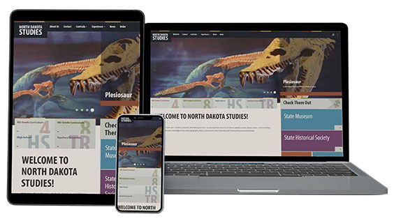
Think of how many screens you encounter in a day. Phones, smart tvs, tablets, smart watches, laptops or notebooks, desktops, smartboards if you’re in a classroom. If you haven’t looked at your website across multiple devices, you have work to do. There might also be places where you want to reorganize or change terms that make sense to your industry, but aren’t that common outside of the silo to better serve your users. And keep an eye on the horizon. Have you thought about how smart speakers might affect your site traffic?
Have you thought about it? Be honest.
3. Haul stuff away to make room for what’s important
When you’ve covered what you can handle (internal resources) and what the audience wants, it’s time for action.
We decided to prioritize our newest online educational content:
Grade 4
Grade 8
Energy
And we made sure we still had room for growth.
How do you decide what to keep on your site? Here is a quick cheat sheet of strategic questions to ask when dealing with content on your website that maybe doesn’t fit into the new structure-
Browser support
If a project is done in a program like flash, it’s no longer supported in browsers. End it.
Usage
There is a difference between a low use area and dying area. Low use might be worth keeping or redoing in the future. The dying track is just that. It is OK to remove content that is at the end of its lifespan.
Analysis and Audit
This will save your team from “But it’s so good” syndrome. What your team thinks is fantastic material isn’t always what the customer values. If material doesn’t help your users, it isn’t fantastic. Each area has to be reviewed and taken on its own merits.
Some decisions are easier than others. At the end of the day, it all comes down to serving the people of North Dakota. And with our new ndstudies.gov website we can do that better. Which comes with the side effect of increased web traffic. Win win!
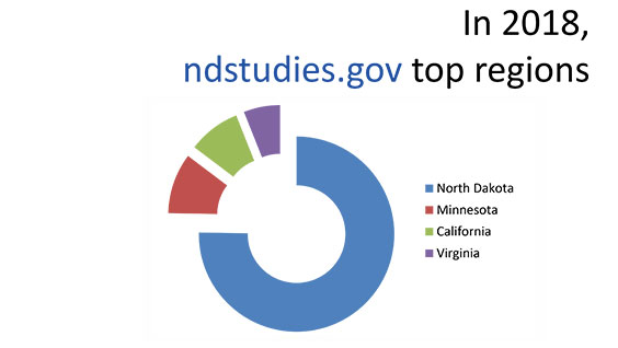
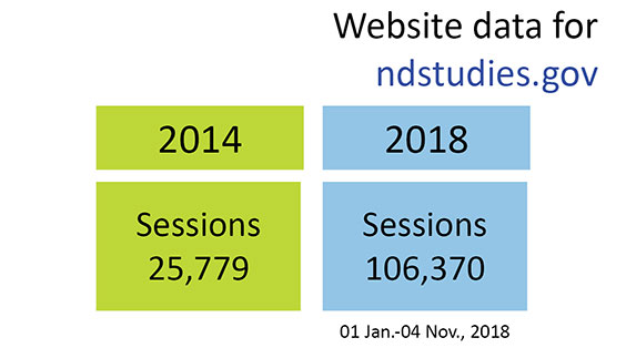
That's an increase of 312%
When you visit ndstudies.gov, you probably don’t think about the people behind the screens in the museum producing all of the online learning options for North Dakota. You are probably thinking about the information you need to find to tackle the job you need to do. You want accurate information that you can find in a flash. Great websites mean continual improvement so that users have a great website experience.
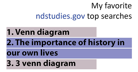
Wow. You guys really like venn diagrams.
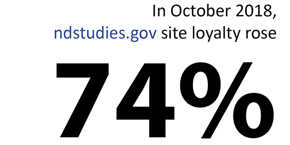
And great website experiences have people coming back for more. Thanks North Dakota!
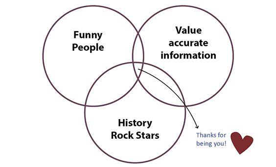
Here's a venn diagram just for you.


