Crafting Exhibit Text: Compelling, Vivid, and Short
What makes compelling exhibit text? I just employed one strategy: opening with a question. Well-crafted exhibits tell stories — both visually through artifacts and photos, and with words by using vivid, concise language to convey colorful, informative histories to our audience.
Ideally, you want the viewer to pause long enough to look, read, reflect, and feel a connection with your topic. Does that anecdote remind them of something a family member told them, or that artifact look just like one in their grandparents’ house? Or, does the exhibit allow the audience to enter a world far removed from their own — either by going back in time, or by exploring a different culture — and yet find a connection through empathizing with a story character, or just from seeing the look in a photographed person’s eyes?
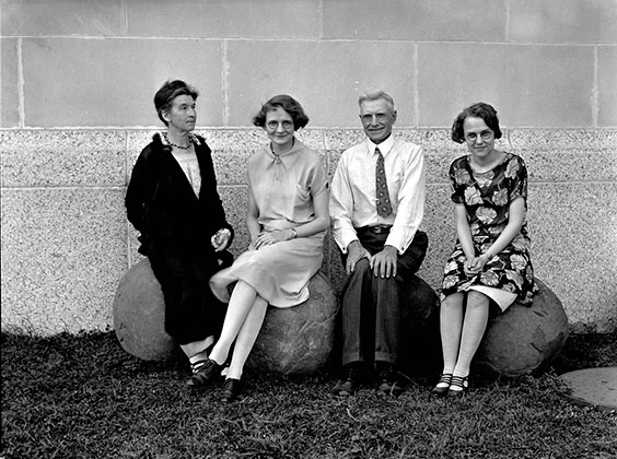
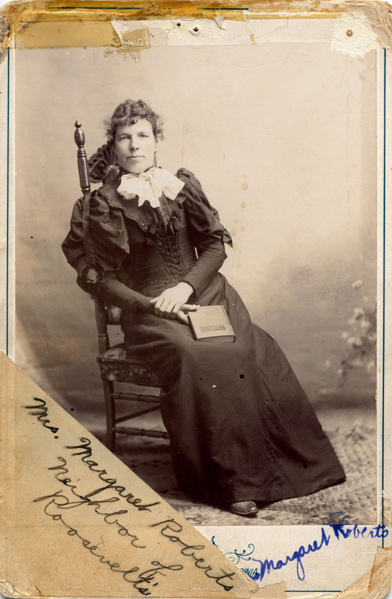
One of my favorite photos of State Historical Society staff, Sept. 5, 1926. Can you relate to the people in the photo? What stories does this image tell? SHSND SA 00200-6x8-00287
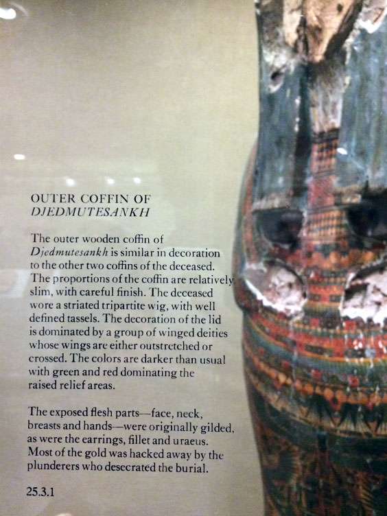
When I travel, I like to stop in museums for exhibit text ideas. In this label from the Metropolitan Museum of Art in New York, look at the last paragraph. What is more compelling, saying, “Most of the gold was stolen by thieves,” or, as they do, “Most of the gold was hacked away by plunderers who desecrated the burial”?
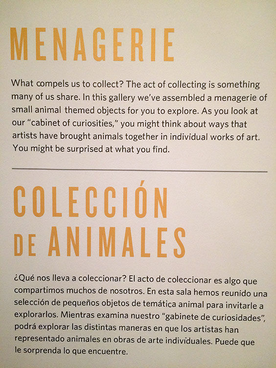
In 2018 I viewed the fantastic Stampede exhibit at the Denver Art Museum depicting a broad range of animals in art. In this label titled “Menagerie,” the text is concise, engaging, and clear — and also translated into Spanish for additional audience inclusion.
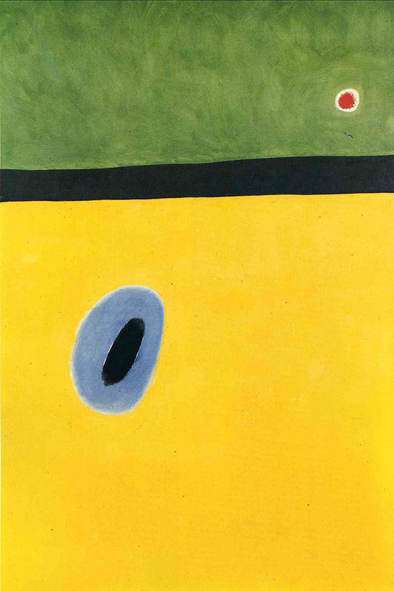
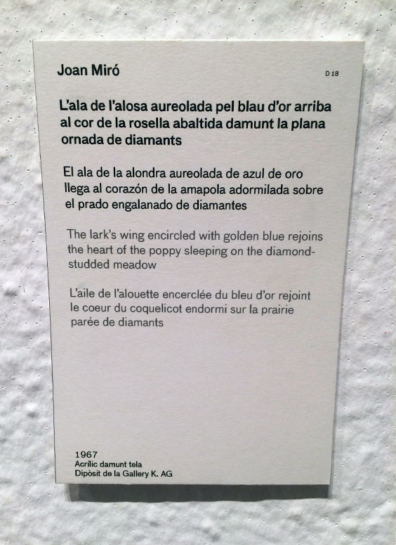
Currently, our State Museum’s Innovation Gallery: Early Peoples features select quotes and audio of several Indigenous languages. In a similar vein, I loved this painting title at Fundació Joan Miró in Barcelona, but can’t imagine routinely proofreading text in four languages (Catalan, Spanish, English, and French).
This fall I was privileged to draft the exhibit text for our current Prairie Post Office exhibit in the James E. Sperry Gallery. This exhibit is unique in that it is based on a book by the same name, written by K. Amy Phillips and Steven R. Bolduc, published by NDSU Press. The exhibit follows the basic structure of the book and incorporates contemporary photography by Wayne Gudmundson, but also adds artifacts and archival photos and whittles the book text way, way down into digestible exhibit labels. Each chapter received about 150 words, not much longer than this paragraph. I tried to take the major themes of the book and add questions, examples, and surprising facts and ideas I learned thanks to the authors’ research.
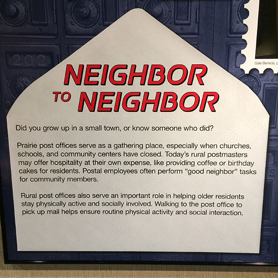
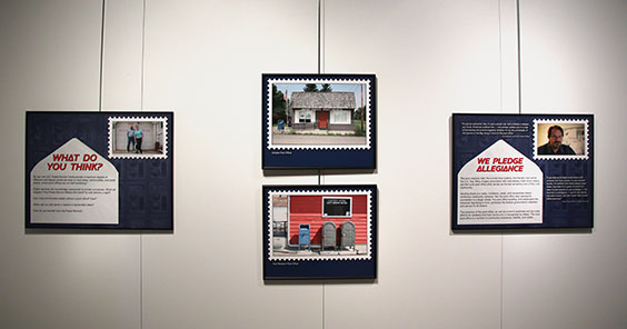
Exhibit panels from The Prairie Post Office, on view through 2021.
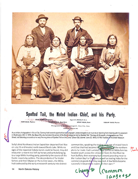
Finalizing the exhibit text was a team effort: members of our editorial and design team, exhibits team, collections staff, and the book authors all reviewed the text and offered feedback. Just like sustaining life in rural communities — the major theme of this exhibit — creating an exhibit takes a village.
I invite you to come view The Prairie Post Office, spend time (briefly) reading, and let us know what you think.


