It’s been four months since I last blogged about The Horse in North Dakota exhibit and behind-the-scenes work is “galloping” along. One of the most important things we’ve learned is that the chance to use horse- related puns isn’t one you can say “neigh” to!
Telling the Story in Three Dimensions
In my last blog I compared an exhibit to telling a story. The biggest difference between a story you’d read in a book and the story you follow in an exhibit is one of dimension. In a book you turn pages to progress through the narrative. In an exhibit a visitor literally moves through the story as they walk from one part of an exhibit to the next.
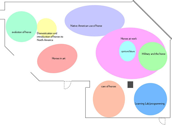
Rather than dividing the story into chapters, I divide an exhibit gallery into topic areas. I start with a “bubble” plan to figure out how much floor space each topic needs and how they connect to each other. In the beginning it looks like this:

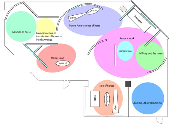
To continue the reading metaphor, most people read books starting with Chapter One and continue sequentially to the end. Not having chapters, an exhibit must provide physical guides to show visitors how to move through the story. So after the bubble plan, the next step is to put in walls or dividers.

The walls suggest a path for visitors to follow and create the suggestion of small rooms that contain topics – almost like a chapter contains a discrete part of a story.
At the same time we are working on the layout we are also developing content – all the parts of the exhibit that convey information. Content can be written text, photographs, videos, audio, hands-on interactives, and the objects, of course. In exhibit design, we have the unique challenge of figuring out how to put different types of content together so they succinctly and clearly convey the information.
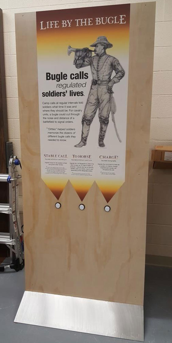
For example, in the military section we’ll discuss the historic US Cavalry. Mounted cavalry had an advantage in war because they could move quickly over large distances. However, there still needed to be a means of communication. Before radios and cell phones there was the bugle.
This panel explains the bugle’s importance, gives visitors a chance to hear bugle calls, and shows what a mid-19th century bugler looked like.

Notice the warm yellow and reddish colors at the top and bottom of the panel. If you refer back to the bubble plan, all of the panels in the “Horses at Work” bubble will use these colors. Other areas, such as “Evolution of the Horse” will have a different color scheme. In addition to the walls, color and graphic design indicate to visitors that they are encountering a new topic as they move through the exhibit.
I hope this brief behind-the-scenes look at exhibit development will add an extra layer of enjoyment when you come to experience The Horse in North Dakota. The exhibit opens on August 25, 2018.


