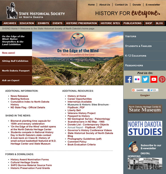
If you’ve visited our website, history.nd.gov, lately, you’ve probably noticed it looks outdated and isn’t mobile friendly. Soon (within the next year or so) we will have a new website! Why so long you ask? There’s a lot that goes into redesigning a website of that size.

The homepage of our current website.
The first thing I looked at was how many pages are on our current website and how we could reduce that number. Some pages had old versions that were still on the website with no way to get to them other than using the search feature. I spent many hours going through all the pages on the website and getting rid of old and duplicate ones. This will make transferring necessary pages to the new website much easier and quicker.
The next item I looked at was website navigation. Our current site doesn’t have the most user-friendly navigation, and we want to make sure visitors can quickly and easily find information. I started looking at other state historical societies’ websites to see how their navigation is set up and how they’re grouping different sections. Our new site will reflect a mix of different societies’ navigation features that we think will work well for us.

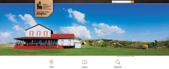
In the header, the light copper is being used behind the logo and tagline, while the dark copper will be used for the navigation and extend the whole width of the page.
After those two steps came the design. Because we have so many other websites, we wanted to keep a design that’s different enough to stand alone but also similar enough to look like it’s part of our family of websites. We accomplished this by using the dark and light copper from history.nd.gov, statemuseum.nd.gov, and blog.statemuseum.nd.gov in different ways but still in the header and footer. The homepage will feature a large, beautiful image of one of our state museums or historic sites that will change with each page refresh.
The next step is coding the website, which I’m currently in the process of doing. Our new website is being built in Drupal, a content management system. This will allow us to edit content from anywhere with an internet connection by simply logging into the website as an administrator.
Once the coding is finished, it will be time to transfer content from the old site to the new site. We will be updating some of the text and many of the images to keep with the fresh look and feel of the new website.
Throughout the last two steps, there will be a lot of testing on my part to make sure everything is functioning properly on the website’s desktop, tablet, and mobile versions as we add more pages and content.
I would love to show you the look of the new website, but then there wouldn’t be a big reveal once it’s ready, so for now I’ll leave you with this little sneak peek. Enjoy, and stay tuned for the launch of the new website!


